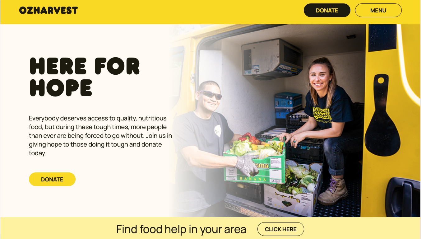
A Major Update
OzHarvest had not updated their website in 15 years, so this major update was a major challenge in many ways.
Originally engaged as a freelancer for Paper Moose to spend 3 weeks on IA, I ended up seeing the project through to the end of the design stage, about 9 months later. The Mooses have written a lovely case study on the project.
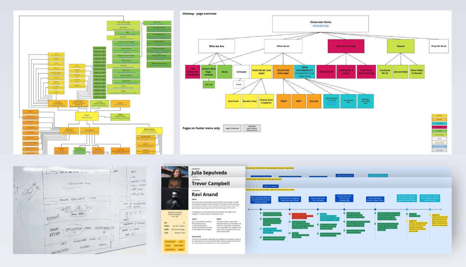
Content Sorting and new IA
Our first priority was a new structure and hierarchy for the organisation’s many arms, making sense of what they do.
Conducting several workshops around content, user journeys and personas, I collaborated with client teams to restructure and slim down 7 WordPress websites with 132 pages into 2 sites with 34 pages.


Wireframing
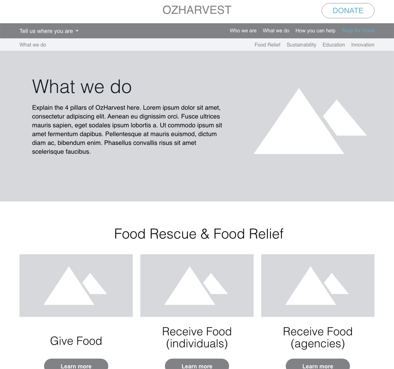
Next, we mapped out how OzHarvest can most easily explain what they do in future. I had opportunity to inject my knowledge about experience design for the NGO sector, and to collaborate on the content design with the client’s comms team.
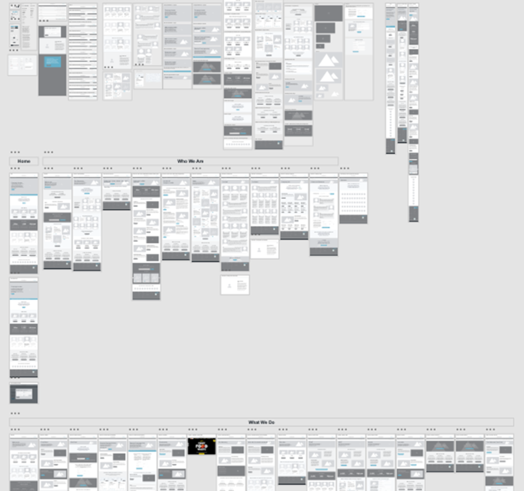
I provided content design and detailed wireframes for all site pages.
UI Design
Paper Moose’s Divya Abe was the UI Design Lead on the project, while I passed on the client context and knowledge I had gained during the UX phase, helping find two on-brand design concepts. We then collaborated in creating final page designs across all breakpoints.

