Active Super is an ESG super fund that underwent a full rebrand and digital transformation with Deepend. Following this, we developed a continuous improvement model for them and tested widely. Our testing showed strongly that ESG focused customers wanted to have a detail view of where their money was invested.
So, we suggested developing a data visualisation tool that answered to this customer need.
Developing a data visualisation tool with a brief of full transparency and the underlying data model unclear at the start of the project was a tough ask. This is the result.
Research
500+
Website users surveyed
Exploring what data they wanted to see from their super fund
2
Data-driven products
Finding two desirable data visualisation tools to develop
3
Data workshops
Close collaboration with the client data team
Product Design
4
Design directions
Initial work on how to present the data as an interactive tool went in a variety of different directions
2
Final outcomes
The two final interactive tools slice and show the investment data from diffferent angles

Website surveys
We ran a series of quick website surveys asking users what information about the investments the fund makes on their behalf were most important to them.
The answer: the countries and industries invested in.
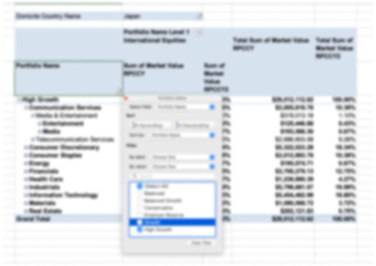
Data model
We collaborated with the client to come up with a data model that allowed us to drill into the investment information from the angles we needed, a new sorting system to what they used internally (I guess unsurprisingly)

Visualising the data
The investment portfolios were presented in detail using a moving zoom function.
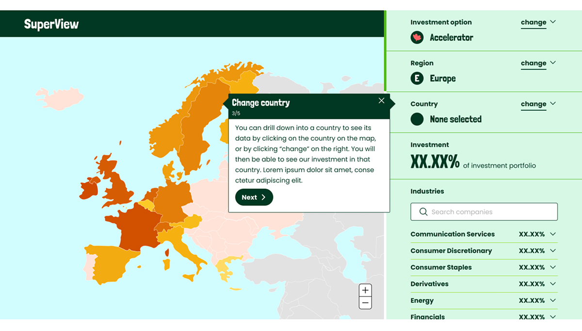
First round wires for drilling into data by country
Our early designs focused on the interaction but contained less depth of data – this design uses a world map with resized countries to visualise the size of investments.

Final design for data world map
In the final map design a right hand panel facilitates filtering and searching so that multiple levels of data can be presented in one view.
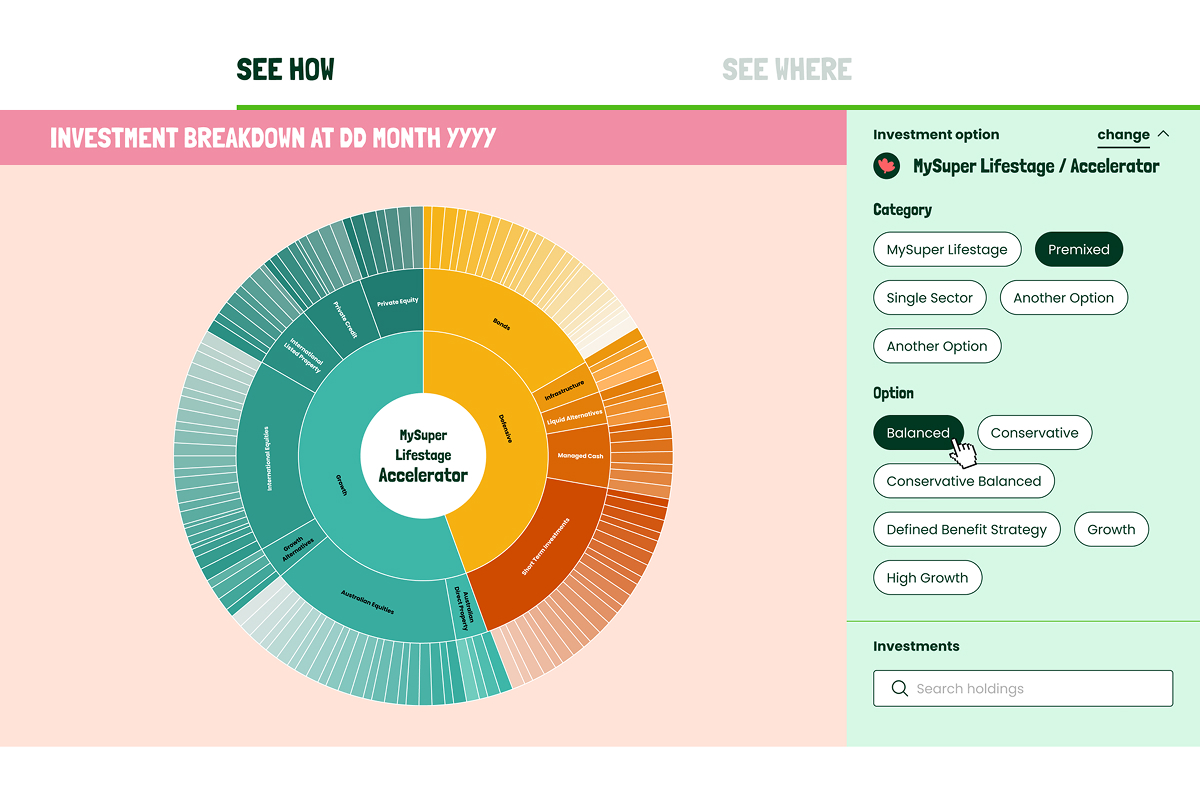
Drilling into multiple levels of data using mouse-activated zoom function
The investment portfolios were presented in detail using a moving zoom function.
This enabled us to show multiple levels of data right down to individual companies, in one pretty tight interactive design.

Final design for ‘sunburst’ zoom visualisation
The final design allows the user to zoom using their mouse, filter on the panel on the right, or search for any company invested in directly.